plotastro
Publication-quality matplotlib figures for astronomy journals.
One pip install gives you journal-matched styles for MNRAS, RASTI,
A&A, ApJ/ApJL, the Open Journal of Astrophysics, PRD/PRL,
JCAP, Nature Astronomy and Euclid Consortium papers — figures
at exactly the right physical size, a colour-blind-friendly palette, and
helpers that make the tedious parts (sizing, panel labels, accessibility
checks, author lists, saving) one-liners.
pip install plotastro # or: conda install -c conda-forge plotastro
Simplest usage — no new API to learn. Importing plotastro registers the
styles with matplotlib itself; after one plt.style.use line you write
ordinary matplotlib, and the default figure size is already the journal’s
column width:
import matplotlib.pyplot as plt
import plotastro                 # just to register the styles

plt.style.use("mnras")           # or "aanda", "apj", "oja", "prd", ...
fig, ax = plt.subplots()         # plain matplotlib from here on
With the helpers (optional, but they make the tedious parts one-liners):
import plotastro as pa

pa.set_style("mnras")
fig, ax = pa.subplots()          # one-column figure, golden-ratio height
ax.plot(x, y, label="model")
ax.set_xlabel("$x$")
ax.legend()
pa.savefig("myplot")             # -> myplot.pdf, ready for \includegraphics
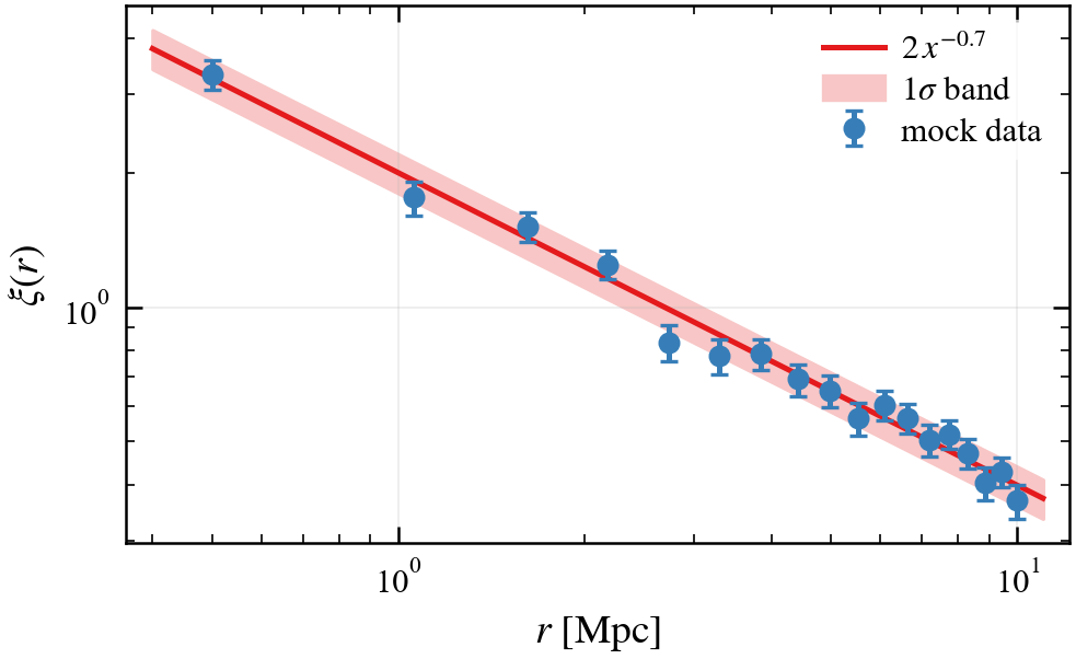
Why plotastro exists
Two problems ruin most paper figures:
Wrong physical size. If you hand LaTeX a 6-inch figure and it squeezes it into an 84 mm column, every label shrinks by ~50 % and becomes unreadable. The fix: build the figure at its final printed width, then include it with a plain
\includegraphics{fig.pdf}— no[width=...].Inaccessible colours. ~5 % of male readers have a colour-vision deficiency, and MNRAS’s author guidelines explicitly ask for colour-blind-friendly figures. The default matplotlib cycle is not; the one here is — and
plotastro.check_figure()lets you verify it.
The styles share one visual language — Times-like serif fonts at ~9 pt with
~8 pt tick lettering, inward ticks on all four sides with minors, a subtle
grid, legends on a translucent white background — and differ only in figure width (plus the
sans-serif fonts Nature requires), so your plots stay consistent between
papers no matter where you submit. The one exception is euclid, which
deliberately matches the Euclid Consortium’s own niceplots look instead
(see Supported journals).
Where to go next
Installation — install options and requirements
Quickstart — the five-minute version
plotastro — tutorial — the full hands-on notebook, rendered
Supported journals — supported journals and their figure widths
Colours — the palettes, colour-blindness checking and CMasher colormaps
Markers, line styles and panel labels — markers, line styles, cyclers and panel labels
Author lists from a CSV — LaTeX author lists from your collaboration’s CSV
API reference — every public function