plotastro — tutorial
Publication-quality matplotlib figures for astronomy journals. This notebook walks through every feature:
Install with pip install plotastro (or pip install -e . from a clone).
The CMasher part of section 3 also needs the optional cmasher package
(pip install cmasher). See README.md for the full reference
documentation.
import sys
from pathlib import Path

import numpy as np
import matplotlib.pyplot as plt

if Path("../src/plotastro").is_dir():    # running from a clone: use its code,
    sys.path.insert(0, "../src")          # even if another release is installed
import plotastro as pa

print("plotastro", pa.__version__)
rng = np.random.default_rng(1)
plotastro 1.0.1
1. Quick start
pa.set_style(journal) activates one of the journal styles, and
pa.subplots() creates a figure that is exactly one column wide for that
journal, with a golden-ratio height. Because the figure already has the right
physical size, you include it in LaTeX without any scaling — so the fonts
on the page come out exactly as designed (~8–9 pt, matching the journal’s own
text).
Available journals: mnras, rasti, aanda (A&A), apj/apjl, oja,
prd/prl, jcap, natastro (Nature Astronomy), euclid (Euclid
Consortium papers, see section 8), plus thesis and beamer width presets.
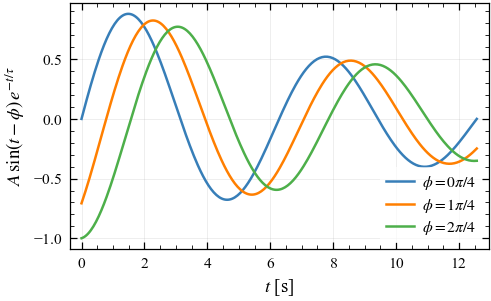
pa.set_style("mnras")

x = np.linspace(0, 4 * np.pi, 300)

fig, ax = pa.subplots()
for i in range(3):
    ax.plot(x, np.sin(x - i * np.pi / 4) * np.exp(-x / 12), label=f"$\\phi = {i}\\pi/4$")
ax.set_xlabel("$t$ [s]")
ax.set_ylabel(r"$A\,\sin(t-\phi)\,e^{-t/\tau}$")
ax.legend()
plt.show()
In LaTeX you would then include it with:
\begin{figure}
    \includegraphics{myplot.pdf}   % no [width=...] needed!
    \caption{...}
\end{figure}
Prefer plain matplotlib? Nothing new to learn
Importing plotastro registers the styles with matplotlib itself, so you can
ignore every helper in this package and keep writing ordinary matplotlib —
one import and one plt.style.use line is the entire integration. The
default figure size baked into each style is already the journal’s column
width:
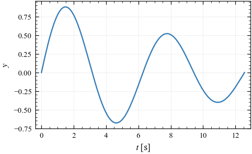
import plotastro                    # just to register the styles

plt.style.use("aanda")              # plain matplotlib from here on
fig, ax = plt.subplots()            # already A&A column-sized
ax.plot(x, np.sin(x) * np.exp(-x / 12))
ax.set_xlabel("$t$ [s]")
ax.set_ylabel("$y$")
plt.show()

pa.set_style("mnras")               # back to the helpers for this tutorial
2. Figure sizes that match your journal
Why bother? If you make a 6-inch-wide figure and LaTeX squeezes it into an 84 mm column, everything shrinks by ~50% — your 10 pt labels become unreadable 5 pt labels. The fix is to build the figure at its final printed size.
pa.figsize() knows the column and full text widths of each journal:
argument |
meaning |
|---|---|
|
one column wide (the default) |
|
full text width (both columns) |
|
any width in LaTeX points (get yours with |
|
a fraction of that width |
|
height/width of one panel (default: golden ratio ≈ 0.618) |
|
height scales with the subplot grid |
print("one column      :", pa.figsize("column"))
print("full width      :", pa.figsize("full"))
print("half a column   :", pa.figsize("column", fraction=0.5))
print("square panel    :", pa.figsize("column", aspect=1))
print("A&A column      :", pa.figsize("column", journal="aanda"))
one column      : (3.3208800332088004, 2.0524167330839185)
full width      : (6.973848069738481, 4.310075139476229)
half a column   : (1.6604400166044002, 1.0262083665419592)
square panel    : (3.3208800332088004, 3.3208800332088004)
A&A column      : (3.464508094645081, 2.1411837567897978)
pa.subplots() accepts the same arguments plus everything plt.subplots
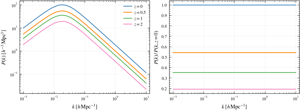
takes (sharex, gridspec_kw, …). A full-width two-panel figure:
k = np.logspace(-3, 1, 300)

fig, axes = pa.subplots(1, 2, width="full", aspect=0.75, sharex=True)
for z in [0, 0.5, 1, 2]:
    pk = 1e4 * k / (1 + (k / 0.02) ** 2.2) / (1 + z) ** 1.5
    axes[0].loglog(k, pk, label=f"$z = {z}$")
    axes[1].semilogx(k, pk / (1e4 * k / (1 + (k / 0.02) ** 2.2)))
axes[0].set_ylabel(r"$P(k)\ [h^{-3}\,\mathrm{Mpc}^3]$")
axes[1].set_ylabel(r"$P(k)\,/\,P(k, z=0)$")
for ax in axes:
    ax.set_xlabel(r"$k\ [h\,\mathrm{Mpc}^{-1}]$")
axes[0].legend()
plt.show()
3. The colour palettes
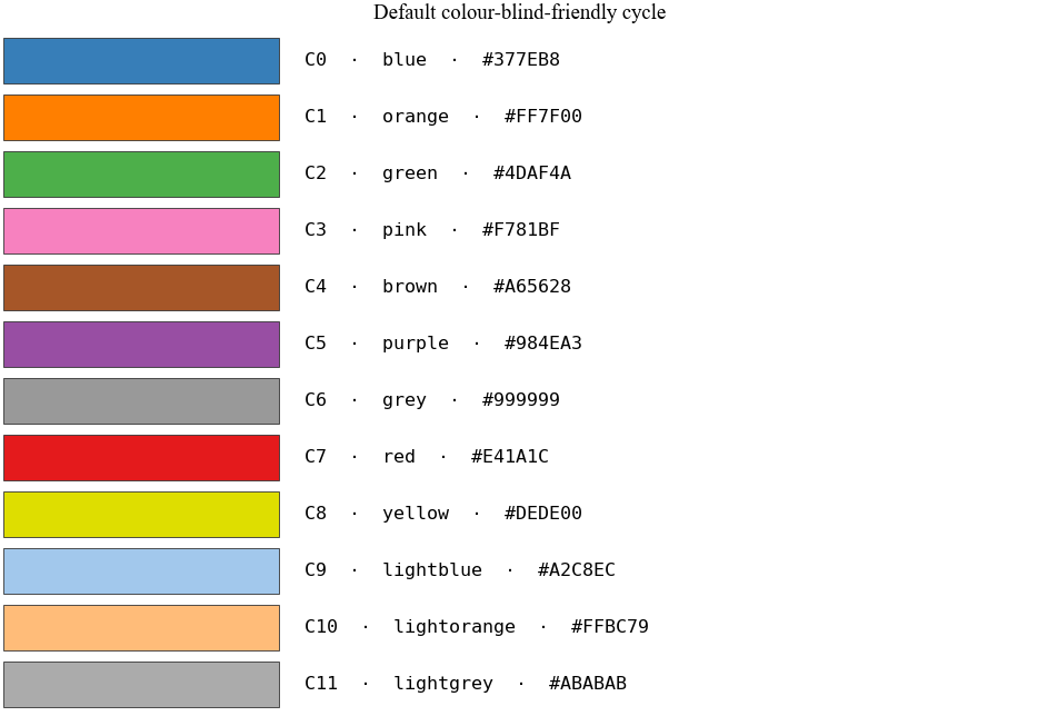
The default colour cycle is designed so that any two neighbouring colours remain distinguishable with the most common forms of colour-vision deficiency (deuteranopia and protanopia, ~5% of male readers — MNRAS explicitly asks for colour-blind-friendly figures).
C0–C8 are a colour-blind-safe re-ordering of the ColorBrewer Set1 palette: red and green are pushed far apart in the cycle (C7 and C2), so consecutive lines never form the classic problem pair, and adjacent colours differ in lightness as well as hue.
C9–C11 are light companions (from Tableau’s Color Blind 10): perfect for uncertainty bands, reference lines, or de-emphasised data under a saturated line of the same hue.
Every colour is available by name via pa.COLORS:
fig = pa.show_colors()
plt.show()
x = np.linspace(0.5, 10, 200)
y = 2 * x ** -0.7

fig, ax = pa.subplots()
ax.plot(x, y, color=pa.COLORS["blue"], label="model")
ax.fill_between(x, 0.85 * y, 1.15 * y,
                color=pa.lighten(pa.COLORS["blue"], 0.7), label=r"$1\sigma$")
ax.plot(x, 1.6 * x ** -0.55, color=pa.COLORS["red"], ls="--", label="alternative")
ax.set_xlabel(r"$r$ [Mpc]")
ax.set_ylabel(r"$\xi(r)$")
ax.loglog()
ax.legend()
plt.show()
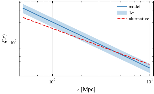
pa.lighten(colour, amount) and pa.darken(colour, amount) create matched
shades — much nicer than alpha, because they stay opaque (no colour shifts
where elements overlap, and they print correctly in EPS).
More palettes ship with the package:
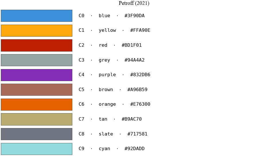
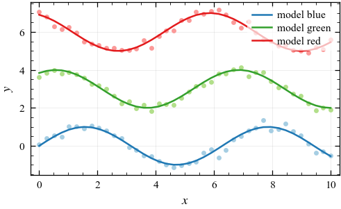
pa.OKABE_ITO— Okabe & Ito (2008), the classic CVD-safe recommendation;pa.PETROFF10— Petroff (2021), the 10-colour CVD-optimised cycle used across particle physics (matplotlib’spetroff10);pa.PETROFF8— Petroff’s 8-colour sibling (matplotlib’spetroff8), the default cycle of the Euclid style (section 8);pa.TOL_VIBRANT— Paul Tol’s vibrant scheme, 7 CVD-safe colours;pa.PAIRED— light/dark pairs for data/model or before/after comparisons:pa.PAIRED["blue"]→(light, dark).
Any of them, or your own list of colours, can become the active cycle when
you activate a style: pa.set_style("mnras", palette="okabe_ito").
fig = pa.show_colors(pa.PETROFF10, title="Petroff (2021)")
plt.show()
x = np.linspace(0, 10, 40)
fig, ax = pa.subplots()
for i, (name, (light, dark)) in enumerate(list(pa.PAIRED.items())[:3]):
    y = np.sin(x + i) + 3 * i
    ax.plot(x, y + rng.normal(0, 0.18, x.size), "o", ms=2.5, color=light)
    ax.plot(x, y, color=dark, label=f"model {name}")
ax.set_xlabel("$x$")
ax.set_ylabel("$y$")
ax.legend()
plt.show()
Colours and colormaps from CMasher (optional)
CMasher (van der Velden 2020, JOSS 5, 2004) is a collection of perceptually uniform scientific colormaps (sequential, diverging and cyclic), most of them colour-vision-deficiency friendly. plotastro can use it for both discrete colours and colormaps, but it is not a dependency. Install it only if you want it:
pip install cmasher # or: pip install "plotastro[cmasher]"
plotastro imports it only when you ask for a CMasher colour. Without it,
those calls raise an ImportError that says how to install it, and the
rest of this notebook works the same.
There are five ways to use it:
you want |
write |
|---|---|
a colour cycle for every figure |
|
a default colormap for every figure |
|
|
|
a colormap, optionally cut or split into levels |
|
a map by name in any matplotlib call |
|
CMasher names start with cmr.. pa.cmasher_colors and pa.cmasher_cmap
accept them with or without the prefix, but set_style and matplotlib
need it. Add _r to a name for the reversed map.
Choosing a map. Pick the type of map from the kind of data:
data |
type of map |
try |
|---|---|---|
lines that must be easy to tell apart; images |
sequential, many hues |
|
steps of one quantity (redshift, mass, time) |
sequential, one hue |
|
signed data around zero (residuals, velocities) |
diverging |
|
angles and phases |
cyclic |
|
The next cell draws some of them. Under each map is its greyscale version,
from pa.simulate_cvd, which is what a black-and-white printout shows:
groups = {
    "sequential, many hues": ["rainforest", "torch", "chroma", "neon"],
    "sequential, one hue": ["ocean", "flamingo", "freeze", "jungle"],
    "diverging": ["fusion", "waterlily", "iceburn", "redshift"],
    "cyclic": ["infinity", "seasons", "seasons_s", "emergency"],
}
gradient = np.linspace(0, 1, 256)[None, :]

fig = plt.figure(figsize=pa.figsize("full", aspect=0.55))
for subfig, (kind, names) in zip(fig.subfigures(len(groups), 1), groups.items()):
    subfig.suptitle(kind, fontsize=7)
    for ax, name in zip(subfig.subplots(1, len(names)), names):
        rgba = pa.cmasher_cmap(name)(gradient)
        grey = pa.simulate_cvd(rgba, "greyscale")
        ax.imshow(np.vstack([rgba[..., :3]] * 2 + [grey[..., :3]]), aspect="auto")
        ax.set_title(f"cmr.{name}", fontsize=6.5, family="monospace", pad=2)
        ax.set_axis_off()
plt.show()
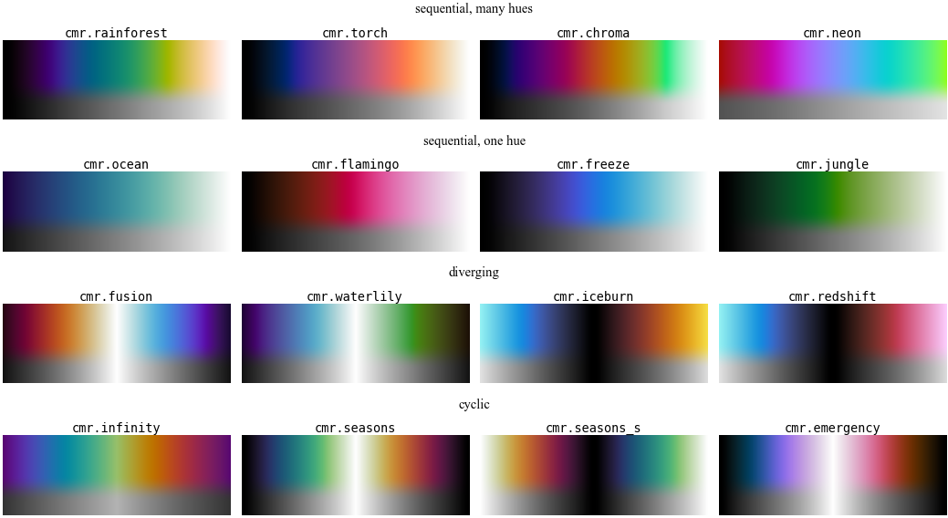
What the greyscale versions show:
In every CMasher sequential map the lightness rises steadily from one end to the other, so the order of the colours survives a black-and-white printout.
A diverging map is equally light at equal distances either side of its centre, so in greyscale
+xand-xlook alike. If the sign matters in print, add contours or say so in the caption. A white centre fades values near zero into the page, which suits print. A black centre makes the extremes the brightest colours, which stands out on dark slides.A cyclic map starts and ends on the same colour. The
_sversions are shifted by half a cycle:seasonsis white in the middle of its range,seasons_sat the ends.
cmasher.get_cmap_list("sequential") (or "diverging", "cyclic") lists
every map, and the CMasher docs show
them all.
Discrete colours. pa.cmasher_colors(name, n) samples n colours
from a map. By default they come from the middle 70 % of it
(cmap_range=(0.15, 0.85)), because most CMasher maps run from black to
white and those ends would vanish on the page. Sampling exactly as many
colours as you have lines makes them span the whole map:
print(pa.cmasher_colors("rainforest", n=4))

z = [0, 0.25, 0.5, 1, 1.5, 2]
k = np.logspace(-3, 1, 300)

fig, ax = pa.subplots()
ax.set_prop_cycle(color=pa.cmasher_colors("rainforest", n=len(z)))
for zi in z:
    ax.loglog(k, 1e4 * k / (1 + (k / 0.02) ** 2.2) / (1 + zi) ** 1.5,
              label=f"$z = {zi}$")
ax.set_xlabel(r"$k\ [h\,\mathrm{Mpc}^{-1}]$")
ax.set_ylabel(r"$P(k)\ [h^{-3}\,\mathrm{Mpc}^3]$")
ax.legend(ncols=2)
plt.show()
['#33034a', '#035f84', '#41a550', '#edc87d']
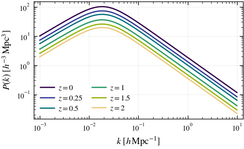
To make a CMasher map the colour cycle of every figure, pass it as the
palette (8 colours): pa.set_style("mnras", palette="cmr.rainforest").
For lines that must be easy to tell apart, CMasher recommends maps with a
large perceptual range (apple, chroma, neon, rainforest, torch);
for steps of one quantity, like the redshifts above, a single-hue map
(flamingo, freeze, gothic, jungle, ocean). Check the result as
you would any other palette:
fig = pa.check_colors(pa.cmasher_colors("torch", n=6))
plt.show()
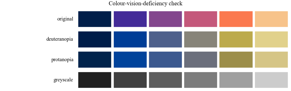
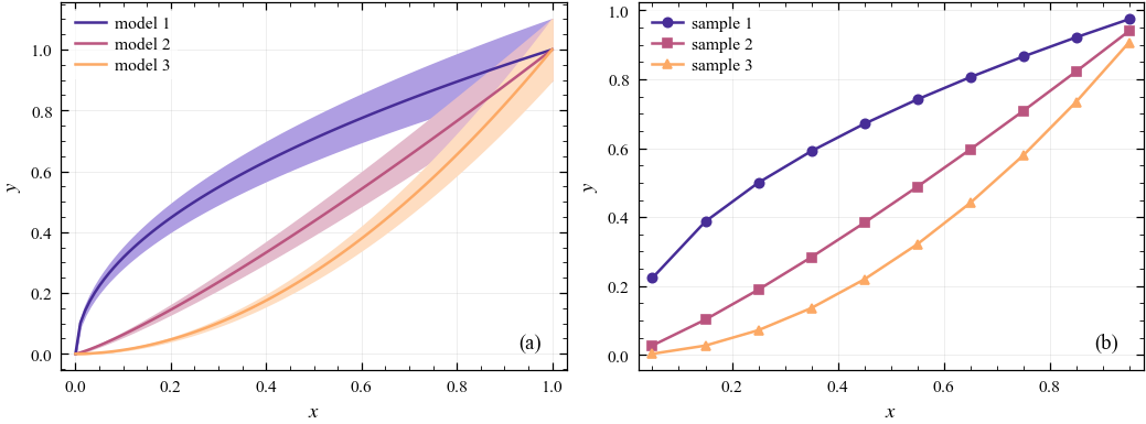
The colours are plain hex strings, so they work anywhere matplotlib takes
a colour. Pass one to pa.lighten for a matching uncertainty band (left).
pa.lighten keeps a colour’s saturation, so a near-black navy would turn
into a strong blue. For bands, start the range above the darkest end, as
with cmap_range=(0.3, 0.8) here.
To make lines differ in greyscale as well, pair the colours with markers
using plt.cycler (right). pa.style_cycler can’t do this, because it
always uses the default palette.
colors = pa.cmasher_colors("torch", n=3, cmap_range=(0.3, 0.8))
x = np.linspace(0, 1, 100)
xd = np.linspace(0.05, 0.95, 10)

fig, (ax1, ax2) = pa.subplots(1, 2, width="full", aspect=0.75)
for i, color in enumerate(colors):
    y = x ** (0.5 + 0.7 * i)
    ax1.plot(x, y, color=color, label=f"model {i + 1}")
    ax1.fill_between(x, 0.9 * y, 1.1 * y, color=pa.lighten(color, 0.6))

ax2.set_prop_cycle(plt.cycler(color=colors) + plt.cycler(marker=pa.MARKERS[:3]))
for i in range(3):
    ax2.plot(xd, xd ** (0.5 + 0.7 * i), label=f"sample {i + 1}")

for ax in (ax1, ax2):
    ax.set_xlabel("$x$")
    ax.set_ylabel("$y$")
    ax.legend(loc="upper left")
pa.label_panels([ax1, ax2], loc="lower right")
plt.show()
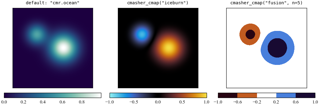
Colormaps. pa.set_style(..., cmap="cmr.<name>") makes a CMasher map
the default for imshow, pcolormesh, scatter and the rest, and
pa.cmasher_cmap(name) returns the map itself. It can also cut the map to
part of its range (cmap_range=) or split it into n discrete levels
(n=), which suits filled contours. Once CMasher is imported, matplotlib
also accepts its maps by name, as in cmap="cmr.iceburn". Note that
iceburn has a black centre, while fusion has a white one:
pa.set_style("mnras", cmap="cmr.ocean")      # the default colormap from now on

yy, xx = np.mgrid[-3:3:200j, -3:3:200j]
blob1 = np.exp(-((xx - 0.8)**2 + yy**2))
blob2 = np.exp(-((xx + 1.2)**2 + (yy - 1)**2) / 0.5)
density = blob1 + 0.6 * blob2              # positive: sequential map
field = blob1 - 0.8 * blob2                # signed: diverging maps
ext = [-3, 3, -3, 3]

fig, axes = pa.subplots(1, 3, width="full", aspect=1)
panels = [
    axes[0].imshow(density, origin="lower", extent=ext),   # the default cmap
    axes[1].imshow(field, origin="lower", extent=ext, vmin=-1, vmax=1,
                   cmap=pa.cmasher_cmap("iceburn")),
    axes[2].contourf(xx, yy, field, levels=np.linspace(-1, 1, 6),
                     cmap=pa.cmasher_cmap("fusion", n=5)),
]
titles = ['default: "cmr.ocean"', 'cmasher_cmap("iceburn")',
          'cmasher_cmap("fusion", n=5)']
for ax, mappable, title in zip(axes, panels, titles):
    fig.colorbar(mappable, ax=ax, orientation="horizontal")
    ax.set_title(title, fontsize=7, family="monospace")
    ax.set(xticks=[], yticks=[], aspect="equal")
    ax.grid(False)
plt.show()

pa.set_style("mnras")   # back to the default colours and colormap
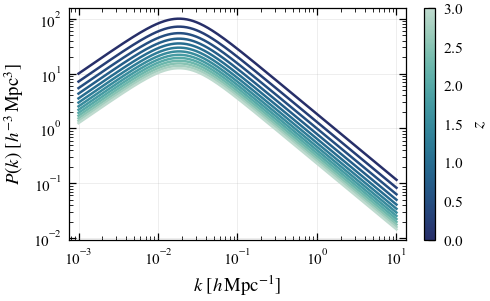
Many lines and a colour bar. With a dozen or more lines, a colour bar
is clearer than a legend. Take the line colours from the same colormap and
normalisation that you give the colour bar, so the two match. Here the map
is cut with cmap_range, so that no line is too pale to see:
import matplotlib as mpl

redshifts = np.linspace(0, 3, 13)
cmap = pa.cmasher_cmap("ocean", cmap_range=(0.15, 0.85))
norm = mpl.colors.Normalize(redshifts.min(), redshifts.max())

fig, ax = pa.subplots()
for zi in redshifts:
    ax.loglog(k, 1e4 * k / (1 + (k / 0.02) ** 2.2) / (1 + zi) ** 1.5,
              color=cmap(norm(zi)))
fig.colorbar(mpl.cm.ScalarMappable(norm=norm, cmap=cmap), ax=ax, label="$z$")
ax.set_xlabel(r"$k\ [h\,\mathrm{Mpc}^{-1}]$")
ax.set_ylabel(r"$P(k)\ [h^{-3}\,\mathrm{Mpc}^3]$")
plt.show()
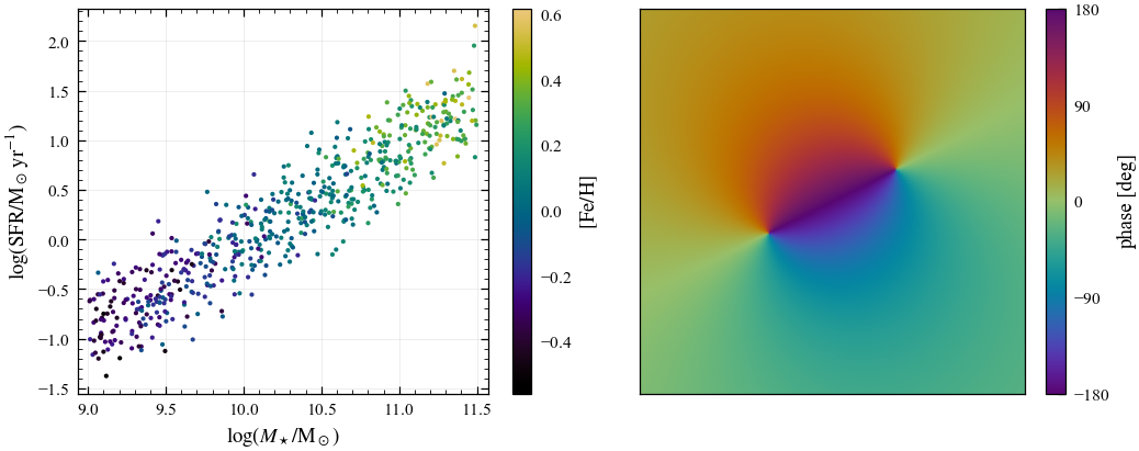
Points coloured by a third quantity, and angles. For a scatter plot, cut the white end off a sequential map, so that no point fades into the page (left). For an angle or a phase, use a cyclic map and set the limits to one full period, so that -180° and +180° get the same colour (right):
gen = np.random.default_rng(7)             # mock galaxies
logm = gen.uniform(9, 11.5, 600)
metal = 0.3 * (logm - 10.2) + gen.normal(0, 0.12, logm.size)
sfr = 0.8 * (logm - 10) + 0.4 * metal + gen.normal(0, 0.25, logm.size)

yy, xx = np.mgrid[-3:3:200j, -3:3:200j]   # the phase of a dipole-like field
zz = xx + 1j * yy
phase = np.degrees(np.angle((zz - (1 + 0.5j)) / (zz + (1 + 0.5j))))

fig, (ax1, ax2) = pa.subplots(1, 2, width="full", aspect=0.8)
sc = ax1.scatter(logm, sfr, c=metal, s=4, linewidths=0,
                 cmap=pa.cmasher_cmap("rainforest", cmap_range=(0, 0.85)))
fig.colorbar(sc, ax=ax1, label=r"$[\mathrm{Fe/H}]$")
ax1.set_xlabel(r"$\log(M_\star/\mathrm{M_\odot})$")
ax1.set_ylabel(r"$\log(\mathrm{SFR}/\mathrm{M_\odot\,yr^{-1}})$")

im = ax2.imshow(phase, origin="lower", extent=[-3, 3, -3, 3],
                cmap=pa.cmasher_cmap("infinity"), vmin=-180, vmax=180)
fig.colorbar(im, ax=ax2, label="phase [deg]", ticks=[-180, -90, 0, 90, 180])
ax2.set(xticks=[], yticks=[], aspect="equal")
ax2.grid(False)
plt.show()
One choice for a whole paper. Set the colours and the colormap once,
when you activate the style, and every figure after that uses them:
pa.set_style("mnras", palette="cmr.rainforest", cmap="cmr.ocean").
Co-authors without CMasher. Discrete colours are plain hex strings. To
let a script run without CMasher installed, print the colours once and
paste the list in its place, as palette=[...]. Colormaps can’t be pasted
in like this, so code that uses a CMasher colormap still needs CMasher:
print(pa.cmasher_colors("rainforest")) # paste this list as palette=[...]
['#33034a', '#3a2090', '#10528a', '#05747c', '#1c926a', '#5cad3c', '#b5b815', '#edc87d']
Common errors.
ImportError: This feature needs the optional CMasher package: runpip install cmasherin the environment you’re using.ValueError: 'cmr.ocean' is not a valid value for cmap, from matplotlib: CMasher hasn’t been imported yet in this session. Any plotastro CMasher call imports it, or addimport cmasherat the top. Passingcmap=pa.cmasher_cmap("ocean")instead of the name also works.ValueError: Unknown palette 'rainforest':set_style(palette=...)needs thecmr.prefix,palette="cmr.rainforest".
If you use CMasher in a paper, please cite it; cmasher.get_bibtex()
prints the reference.
4. Checking colour-blind accessibility
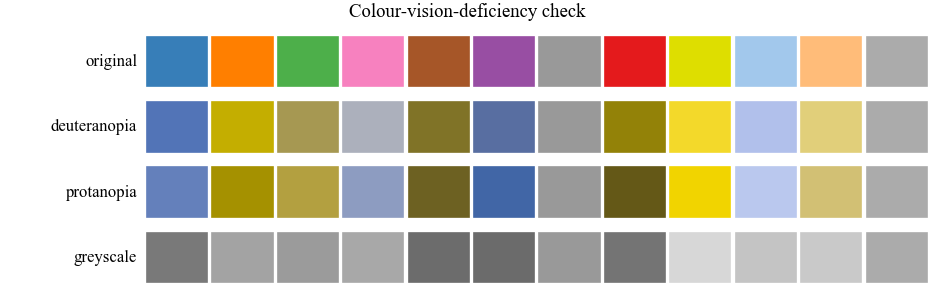
Don’t take the palette’s word for it — check. pa.check_colors() shows any
palette under simulated deuteranopia, protanopia and greyscale
(Machado et al. 2009 model, the same one behind most online simulators):
fig = pa.check_colors()          # the default cycle
plt.show()
Even better, pa.check_figure(fig) simulates a whole rendered figure —
the perfect final check before submitting:
fig, ax = pa.subplots()
x = np.linspace(0, 2 * np.pi, 200)
for i in range(4):
    ax.plot(x, np.sin(x + i / 2), label=f"C{i}")
ax.legend(ncols=2)
ax.set_xlabel("$x$")

check = pa.check_figure(fig)
plt.show()
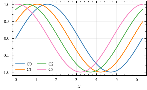

If two lines merge in any panel, add markers or dash patterns (next section) or pick colours further apart in the cycle.
5. Markers and line styles
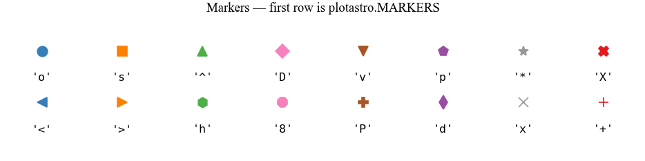
pa.MARKERS is a sequence chosen to stay distinguishable at small (4 pt)
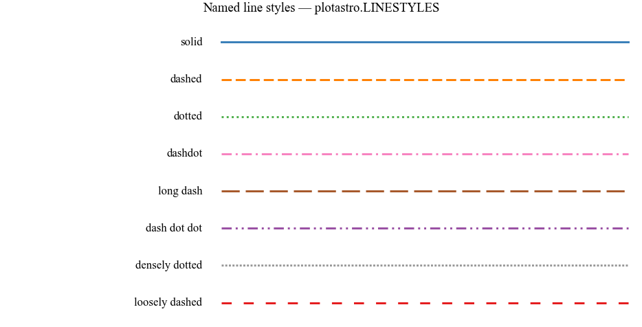
sizes, and pa.LINESTYLES provides named dash patterns beyond matplotlib’s
four built-ins:
fig = pa.show_markers()
plt.show()
fig = pa.show_linestyles()
plt.show()
Cycling colours, markers and line styles together
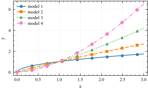
pa.style_cycler() builds a property cycle that advances colour, marker
and/or dash pattern in step — redundant encoding, so every series is unique
in two or three channels at once and survives greyscale printing.
Use markevery to avoid a solid wall of markers on dense data:
x = np.linspace(0, 3, 60)

fig, ax = pa.subplots()
ax.set_prop_cycle(pa.style_cycler(markers=True, linestyles=True))
for n in range(4):
    ax.plot(x, x ** (0.5 + 0.4 * n), markevery=7, label=f"model {n + 1}")
ax.set_xlabel("$x$")
ax.set_ylabel("$y$")
ax.legend()
plt.show()
To apply such a cycle to all figures instead of a single axes:
plt.rc("axes", prop_cycle=pa.style_cycler(markers=True))
6. Panel labels
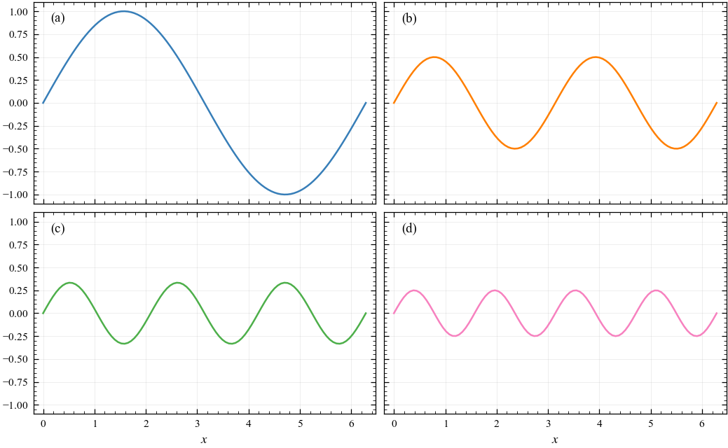
Journals want multi-panel figures labelled (a), (b), (c)… —
pa.label_panels() does it in one line, in reading order:
fig, axes = pa.subplots(2, 2, width="full", sharex=True, sharey=True)
x = np.linspace(0, 2 * np.pi, 100)
for i, ax in enumerate(axes.flat):
    ax.plot(x, np.sin((i + 1) * x) / (i + 1), color=f"C{i}")
for ax in axes[1]:
    ax.set_xlabel("$x$")
pa.label_panels(axes)
plt.show()
Options: loc (“upper left”, “upper right”, “lower left”, “lower right”,
or “outside” for the Nature-style bold letter above the corner), fmt
("{}." → “a.”), uppercase=True, explicit labels=[...], and any ax.text
keyword:
pa.label_panels(axes, loc="outside", fmt="{}", fontweight="bold")
7. Real-world examples
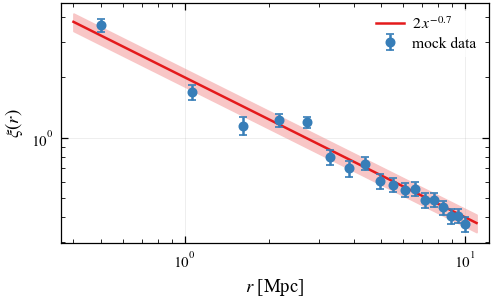
Data with error bars and a fitted model
x = np.linspace(0.5, 10, 18)
truth = 2.0 * x ** -0.7
y = truth * rng.normal(1, 0.08, x.size)

fig, ax = pa.subplots()
ax.errorbar(x, y, yerr=0.08 * truth, fmt="o", color=pa.COLORS["blue"],
            label="mock data", zorder=3)
xf = np.linspace(0.4, 11, 200)
ax.plot(xf, 2.0 * xf ** -0.7, color=pa.COLORS["red"], label=r"$2\,x^{-0.7}$")
ax.fill_between(xf, 1.8 * xf ** -0.7, 2.2 * xf ** -0.7,
                color=pa.lighten(pa.COLORS["red"], 0.75), zorder=0)
ax.loglog()
ax.set_xlabel(r"$r$ [Mpc]")
ax.set_ylabel(r"$\xi(r)$")
ax.legend()
plt.show()
Comparing distributions
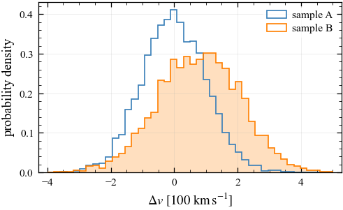
Use histtype="step" for overlapping histograms — filled histograms hide
each other, stepped ones don’t:
a = rng.normal(0.0, 1.0, 4000)
b = rng.normal(0.8, 1.3, 4000)
bins = np.linspace(-4, 5, 45)

fig, ax = pa.subplots()
ax.hist(a, bins, histtype="step", lw=1.2, label="sample A", density=True)
ax.hist(b, bins, histtype="step", lw=1.2, label="sample B", density=True)
ax.hist(b, bins, color=pa.lighten(pa.COLORS["orange"], 0.75),
        density=True, zorder=0)
ax.set_xlabel(r"$\Delta v\ [100\ \mathrm{km\,s^{-1}}]$")
ax.set_ylabel("probability density")
ax.legend()
plt.show()
Images with a colour bar
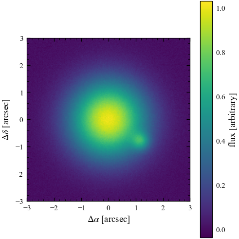
The default colormap is viridis (perceptually uniform and colour-blind
safe). Change it for every image with pa.set_style("mnras", cmap="cividis"),
or use a CMasher map (section 3). For images, a square panel usually looks best — pass aspect=1.
For astronomical images you typically also want origin="lower":
yy, xx = np.mgrid[-3:3:200j, -3:3:200j]
img = np.exp(-(xx**2 + yy**2) / 2) + 0.35 * np.exp(-((xx - 1.2)**2 + (yy + 0.8)**2) / 0.1)
img += rng.normal(0, 0.01, img.shape)

fig, ax = pa.subplots(aspect=1)
im = ax.imshow(img, extent=[-3, 3, -3, 3], origin="lower")
fig.colorbar(im, ax=ax, label="flux [arbitrary]")
ax.set_xlabel(r"$\Delta\alpha$ [arcsec]")
ax.set_ylabel(r"$\Delta\delta$ [arcsec]")
ax.grid(False)
plt.show()
8. Switching journals
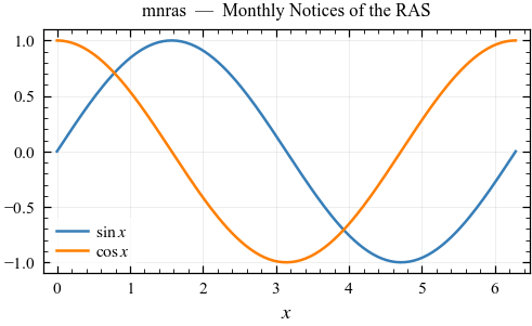
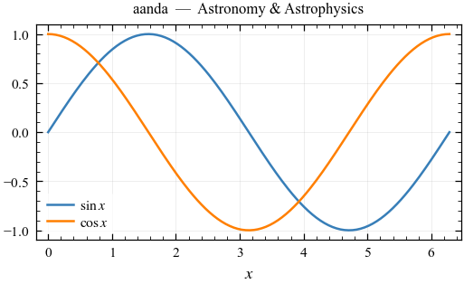
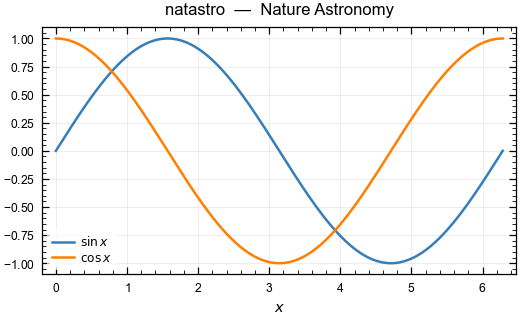
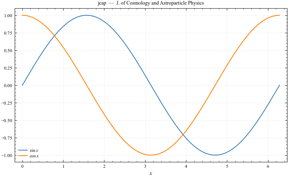
The styles share one visual language — fonts, colours, tick and legend
settings — and differ only in figure width (and, for Nature Astronomy, the
sans-serif font its guidelines require); the exception is euclid, which
matches the Euclid Consortium’s own look (below). Your plots stay consistent across
papers; switching is a single call. Note the sans-serif fonts and single-wide-
column JCAP layout below:
x = np.linspace(0, 2 * np.pi, 200)

for journal in ["mnras", "aanda", "natastro", "jcap"]:
    pa.set_style(journal)
    fig, ax = pa.subplots()
    ax.plot(x, np.sin(x), label=r"$\sin x$")
    ax.plot(x, np.cos(x), label=r"$\cos x$")
    ax.set_title(f"{journal}  —  {pa.JOURNALS[journal]['name']}", fontsize=8)
    ax.set_xlabel("$x$")
    ax.legend()
    plt.show()

pa.set_style("mnras")   # back to default for the rest of the notebook
Also available: rasti, apj, oja, prd, the thesis/beamer
width presets, and euclid (next). You can override any rcParam per session:
pa.set_style("mnras", grid=False)                    # no grid
pa.set_style("mnras", palette="okabe_ito")           # another colour cycle
pa.set_style("mnras", cmap="cividis")                # another default colormap
pa.set_style("mnras", **{"font.size": 10})           # bigger fonts
Euclid Consortium papers
pa.set_style("euclid") reproduces the look of
niceplots, the Euclid
Consortium Editorial Board’s matplotlib style for Euclid papers
(Euclid-internal, GPL-3.0; set up by Lukas Hergt, with tweaks by Laila
Linke). The style and its colour schemes are adapted from that repository:
the settings are re-expressed in plotastro’s own template, and nothing is
copied from it.
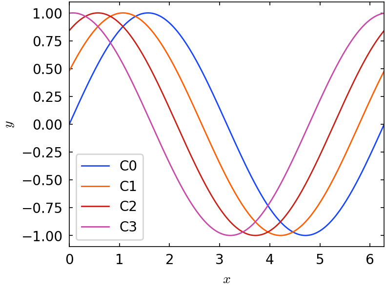
Unlike the other styles, it uses sans-serif 10 pt text with Computer
Modern maths, no grid or minor ticks, framed legends, and Petroff’s 8
colours (pa.PETROFF8). It also follows niceplots’ sizing convention:
figures are drawn 4 × 3 in and LaTeX scales them into the A&A column, so
include them with \includegraphics[width=\columnwidth]{fig.pdf}.
niceplots’ other colour schemes are available under their niceplots names,
as a palette (pa.set_style("euclid", palette="categorical3")) or as a
list from pa.euclid_colors(): "categorical1" (the default),
"categorical2" (Okabe & Ito), "categorical3" (black, then Tol’s
vibrant), and n colours from "sequential" (copper) or
"diverging" (coolwarm).
pa.set_style("euclid")

x = np.linspace(0, 2 * np.pi, 200)
fig, ax = pa.subplots()                  # 4 x 3 in, as niceplots draws it
for i in range(4):
    ax.plot(x, np.sin(x + i / 2), label=f"C{i}")
ax.set_xlabel("$x$")
ax.set_ylabel("$y$")
ax.legend()
plt.show()

print(pa.euclid_colors("sequential", n=4))
pa.set_style("mnras")   # back to default for the rest of the notebook
['#000000', '#4f3220', '#9e6440', '#ed9660']
9. LaTeX text rendering
By default the styles use matplotlib’s built-in mathtext with STIX fonts — Times-compatible maths that works everywhere, with no LaTeX installation required.
If you have LaTeX installed and want pixel-perfect consistency with your manuscript (custom macros, real kerning), turn on full LaTeX rendering:
pa.set_style("mnras", usetex=True)
This uses the newtx font packages (the modern Times fonts — MNRAS and A&A
are typeset in Times); for Nature Astronomy it switches to Helvetica instead.
It needs latex, dvipng and ghostscript on your PATH, and rendering is
noticeably slower — a good workflow is to develop with usetex=False and
flip it on for the final version.
10. Saving figures for submission
The styles already save with sensible settings: PDF (vector) by default,
450 dpi for rasterised elements (journals ask for ≥ 300–400 dpi), tight
bounding box, and TrueType fonts embedded (pdf.fonttype: 42 — avoids the
Type-3 font errors journal submission systems complain about).
pa.savefig writes several formats in one call — e.g. a PDF for the
manuscript and a PNG to paste into slides or collaboration chats:
import tempfile, os
outbase = os.path.join(tempfile.mkdtemp(), "figure1")

fig, ax = pa.subplots()
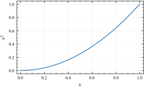
ax.plot(np.linspace(0, 1, 50), np.linspace(0, 1, 50) ** 2)
ax.set_xlabel("$x$")
ax.set_ylabel("$x^2$")

pa.savefig(outbase, fig=fig, formats=("pdf", "png"))
['/var/folders/49/gftfyhj56zs1lz_zs90jcw000000gn/T/tmp8_gemow7/figure1.pdf',
 '/var/folders/49/gftfyhj56zs1lz_zs90jcw000000gn/T/tmp8_gemow7/figure1.png']
Per-journal notes
journal |
accepted figure formats |
notes |
|---|---|---|
MNRAS / RASTI |
EPS preferred, PDF/TIFF fine |
≥ 400 dpi raster, ~8 pt lettering, colour-blind friendly required |
A&A |
PDF/EPS |
figures 88 mm (column) or 170–180 mm (page) wide |
ApJ / AAS |
PDF/EPS/PNG |
vector strongly preferred |
OJA |
PDF (arXiv-ready) |
whatever compiles on arXiv works |
PRD / JCAP |
PDF/EPS |
vector preferred |
Nature Astronomy |
PDF/EPS/AI |
sans-serif fonts, 5–7 pt lettering |
If a journal insists on EPS, note EPS has no transparency — replace
alpha= with pa.lighten() shades (another reason they are the better
habit).